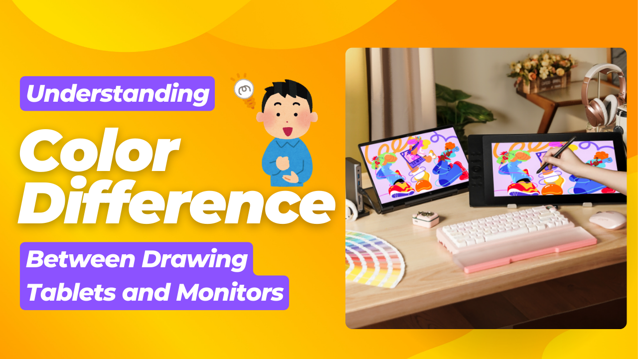
Color management helps ensure that colors look the same on all devices. It uses standard profiles and tools to adjust colors on monitors, printers, cameras, and pen displays (drawing monitors) to match everything you use. This matching is essential for people who create digital art. When digital art painters see a color on their screen, they need to know it will look the same when printed or viewed on other screens.

Understanding Color Spaces and Profiles
A color space shows what colors a device can display. Different color spaces can show different numbers of colors, with some showing more than others.
1. sRGB is the most common color space on the web and digital screens. It has fewer colors than other options.
2. Adobe RGB gives you more colors than sRGB, especially in greens and blues. This makes it better for print design and professional photography, where you need more color options.
3. Display P3 offers even more colors than sRGB and is used in Apple devices and high-end displays based on DCI-P3.
4. DCI-P3 also offers a broader color gamut than sRGB, with richer reds and greens. Compared to Display P3, it has different white points and gamma.
ICC profiles are files that describe how a specific device shows colors within a color space. These profiles help ensure that colors look right by adjusting them based on each device's unique characteristics.
Managing Color Profiles in Windows and macOS
Windows Color Management
Windows has a color management system you can find through the Control Panel or by searching for "Color Management" in the Start Menu. Select each connected display under the "Devices" tab and check the box next to "Use my settings for this device." To add or change a color profile for a display, click "Add," find the ICC profile you want, select it, and click "Set as Default Profile." The "Advanced" tab has more options. Windows may get confused with multiple monitors. If this happens, try uninstalling and reinstalling the monitors in Device Manager or updating your graphics drivers.
MacOS Color Management
MacOS provides tools to manage color profiles through System Settings and the ColorSync Utility. You can change a display's color profile by going to Apple menu > System Settings > Displays and clicking the menu next to "Color profile." Here you can pick from the installed profiles. Selecting "Customize" opens the Display Calibrator Assistant where you can create your own profiles. The ColorSync Utility is in Applications > Utilities and offers more advanced options. Some newer Mac models use built-in reference modes instead of traditional color profiles.
Ensuring Consistent Color Profile Usage Across Multiple Displays
Use the same working color space in both places to ensure that colors look the same on your drawing tablet and external monitor. While you might not be able to use the same ICC profile for different monitor models, you should use the same target color space. Some applications might ignore the system's color settings. Check each application's color management settings to ensure they match your intended workflow.
Fine-Tuning Display Settings: Brightness, Contrast, and Gamma
How These Settings Affect Color Perception
Brightness is the amount of light coming from your display. It affects how light or dark all colors look on your screen. Contrast is the difference between the brightest white and darkest black your display can show.
This setting changes how vibrant colors appear and how much detail you can see in both bright and dark areas. Gamma mainly affects the middle brightness levels without changing the darkest blacks or brightest whites. Even with the same color profiles, different brightness, contrast, and gamma settings between devices can make colors look different.
Recommended Baseline Settings for Creative Work
A good starting brightness is around 120 cd/m2. This level helps achieve a neutral white balance that isn't too harsh on your eyes. Setting both displays to 6500K (also called D65) is usually best for color temperature because it matches standard daylight. A gamma setting of 2.2 works well for both Windows and Mac computers. Contrast should be set so you can see details in both very light and very dark areas without losing information. These settings provide a good foundation, but you might need to adjust them based on your preferences and what your displays can do.
Using Test Patterns to Optimize Brightness, Contrast, and Gamma
To get better settings, use test patterns you can find online. Look for "grayscale ramp test image" or "brightness and contrast test pattern." When adjusting brightness, ensure you can clearly see the darkest and lightest areas. For contrast, you want different shades of gray to be distinct without looking harsh or flat. When checking gamma with a grayscale test, the change from black to white should be smooth with no sudden jumps. By looking at these test patterns on both your drawing tablet and monitor, you can make adjustments until both screens look more alike.
Key Color Profiles and Their Uses
| Color Profile | Description | Best Use Cases |
|---|
| sRGB | Standard RGB color space, widely used for web content and digital displays. | Web design, online viewing, most general-purpose applications. |
| Adobe RGB | Wider color gamut than sRGB, especially in greens and blues. | Print design, photography, professional workflows where a wider color range is needed. |
| Display P3 | Color space used in modern Apple devices, wider gamut than sRGB. | Modern macOS and iOS applications, HDR content. |
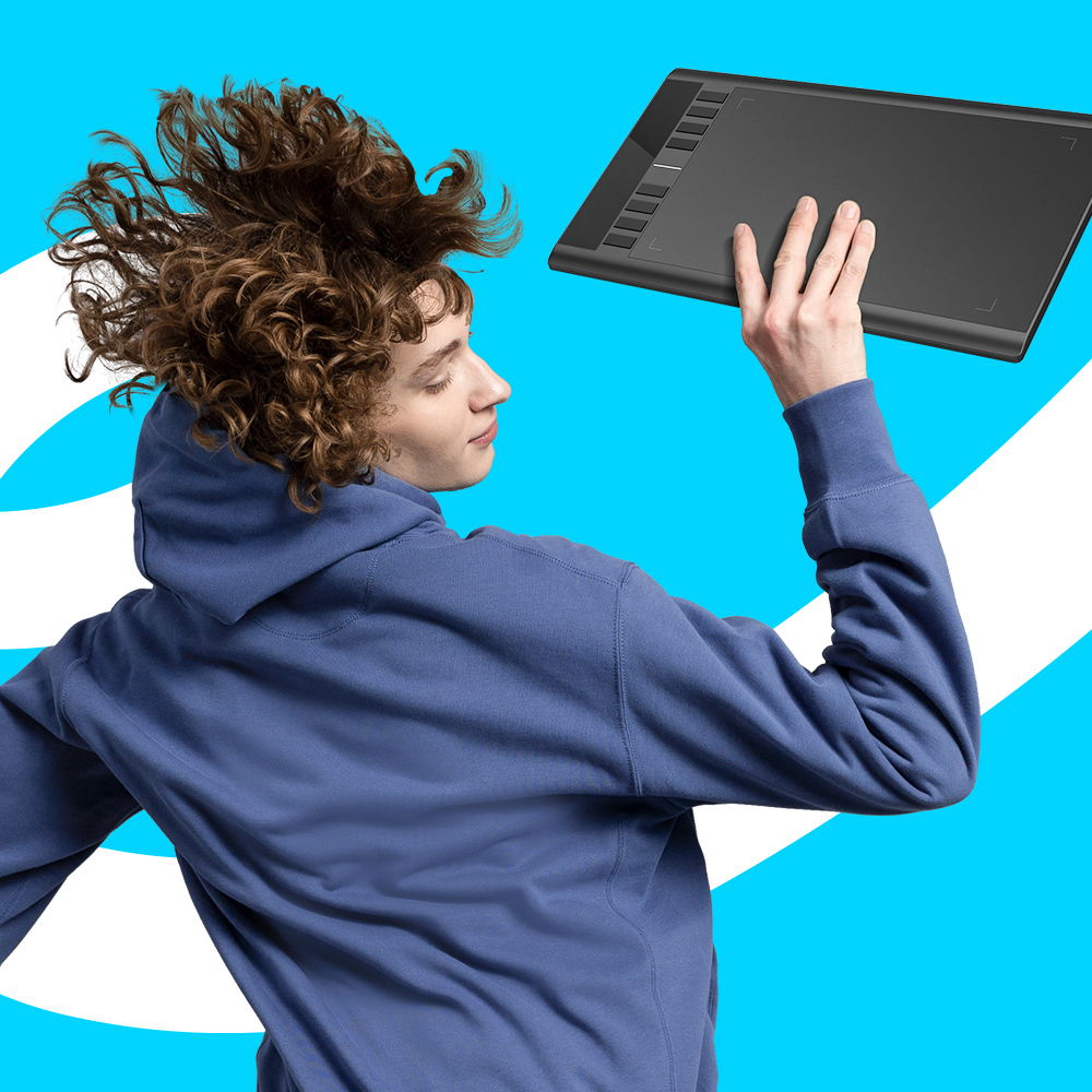
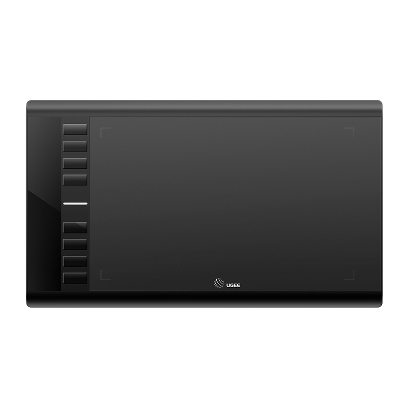
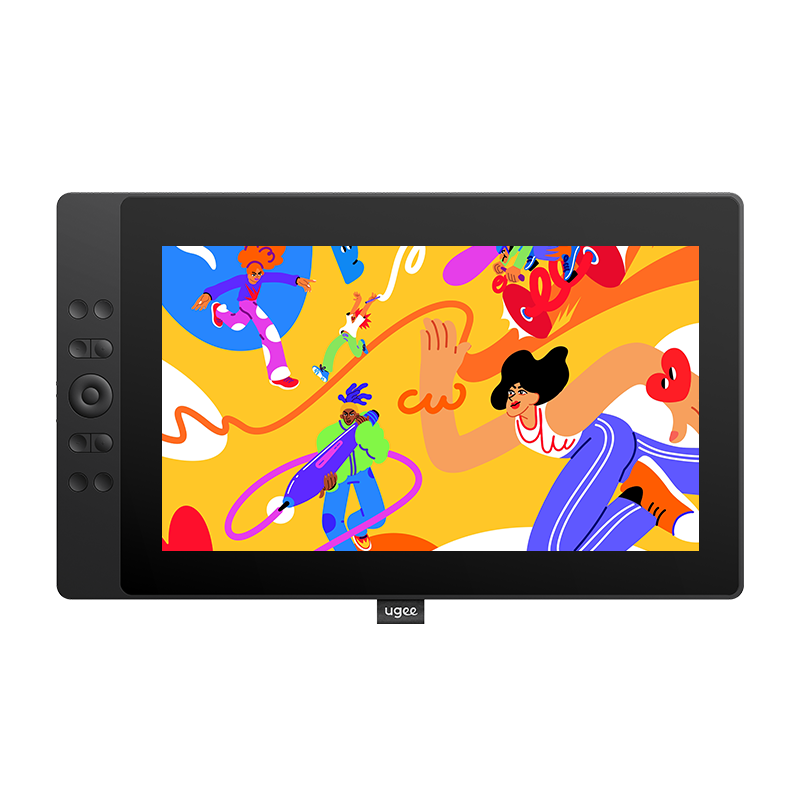
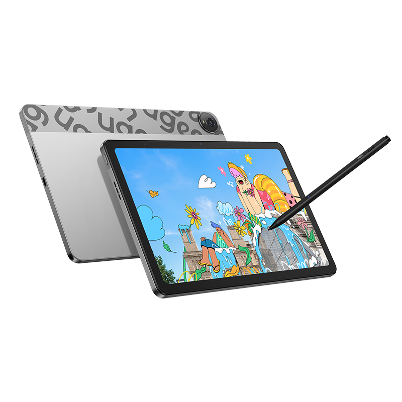
Recommended Drawing Tablets with a Wide Range of Color Space
If you don't want to adjust the color space above on your monitor, the ugee UE-series drawing tablets with the screen (pen display) give digital drawing lovers more color options. These expanded palettes let you capture subtle color differences, making the artwork look more affluence and detailed.
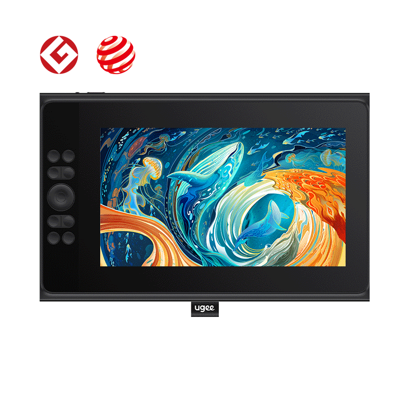
UE12 offers three color spaces: DCI-P3, sRGB, Adobe RGB, and 124% sRGB color gamut, which can show 24% more colors than the standard sRGB space.
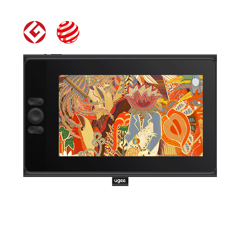
UE12plus also offers three color spaces: DCI-P3, sRGB, and Adobe RGB, but with 147% sRGB color gamut, it can show 47% more colors than the original sRGB space.
UE16 as four color spaces: Black & White mode, DCI-P3, sRGB, Adobe RGB, and a 145% sRGB color gamut.
Why Are Different Color Spaces on Digital Drawings Important?
1. Enhanced Precision in Color Selection
Different color spaces help painters control their palettes better. Adobe RGB covers more colors than sRGB, which helps when making artwork for print. This option lets artists choose the right color space for their projects.
2. Improved Collaboration
Color management ensures everyone sees the same colors regardless of their device. This consistency is key for good feedback and revisions on team projects. When files move between team members, the colors stay true, reducing mistakes and confusion about how colors should look.
3. Future-proofing Artwork
Color-managed workflows help protect your art for years to come. Your work can quickly adapt, whether it ends up online or in print. This flexibility makes it simple to adjust your artwork without losing quality.
Conclusion
Make sure your computer's color settings are consistent across all programs. It is also important to adjust screen brightness and other display settings.